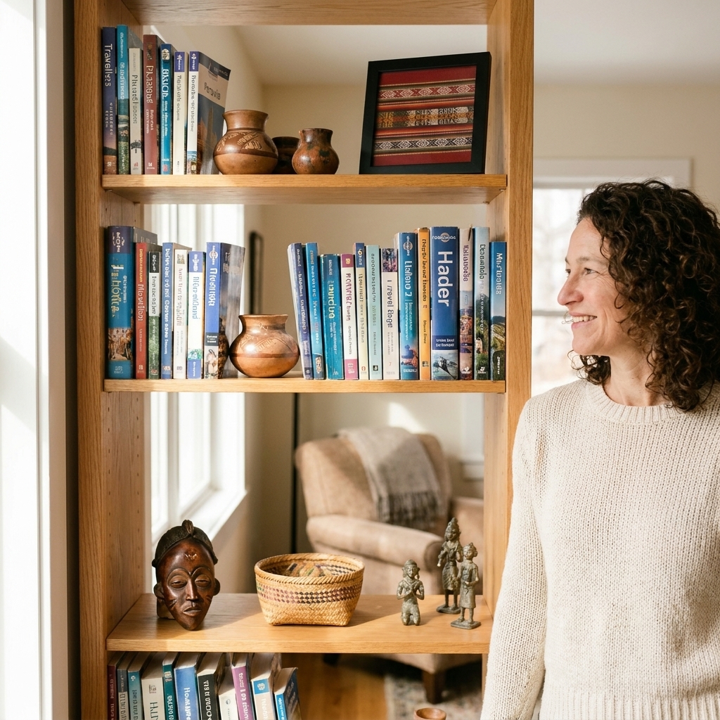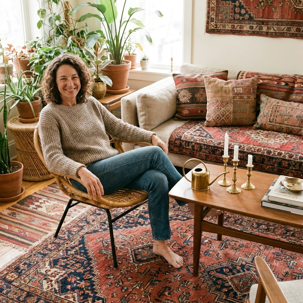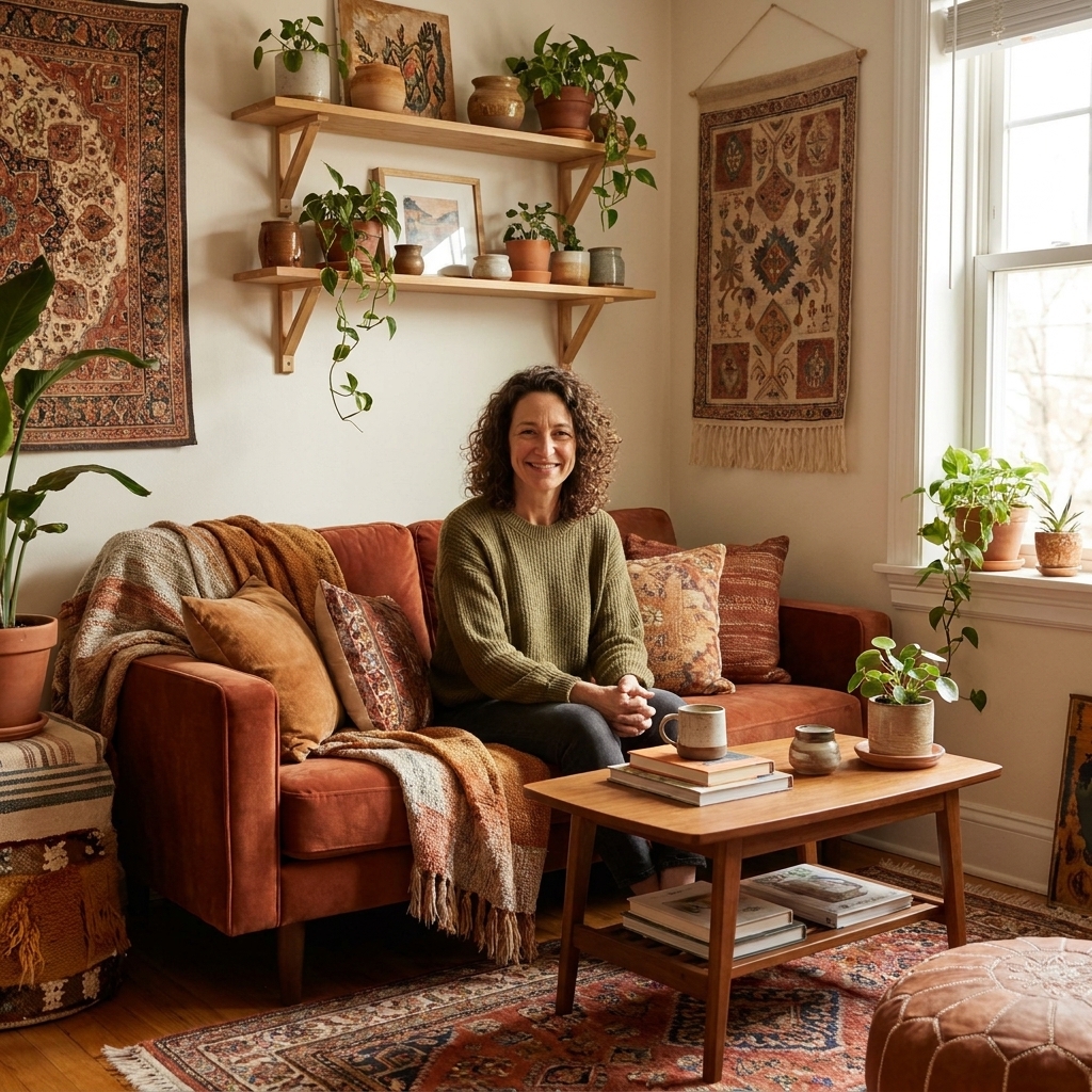

The fastest way I know to make a room feel like you is a gallery wall that looks collected over time. Not “bought as a set,” not perfectly matchy, and definitely not precious. I grew up on road trips where we’d come home with little postcards, textiles, and oddball souvenirs, and that same energy is what I aim for on my walls: a mix of memories, color, texture, and a few happy surprises.
If the idea of mixing frames, art styles, and even woven hangings makes you nervous, don’t worry. Eclectic does not mean random. It means curated with a few simple rules. Let’s build one that feels layered and intentional.

Choose your thread
When a gallery wall goes sideways, it’s usually because there’s no unifying thread. Your thread can be subtle. It just needs to be consistent.
- Color thread: repeat 2 to 4 colors across the wall (terracotta, inky navy, cream, moss green).
- Material thread: repeat wood tones, brass, black metal, rattan, or woven fibers.
- Theme thread: travel photos, botanicals, abstract shapes, portraits, vintage maps, textile fragments.
- Shape thread: lots of rectangles with a few rounds, or mostly squares, or a strong horizontal row.
- Negative space thread: all pieces have white borders, or all pieces go full-bleed (no mat or border).
I usually pick two threads, not one. For example: “warm wood frames + earthy color palette,” or “black frames + lots of white space.” That’s enough to let the rest be joyfully mixed.
If your wall needs help with pattern confidence in general, you’ll probably enjoy How to Mix Bold Patterns Without Clashing. The same concept applies: repetition creates calm.
Gather, then edit
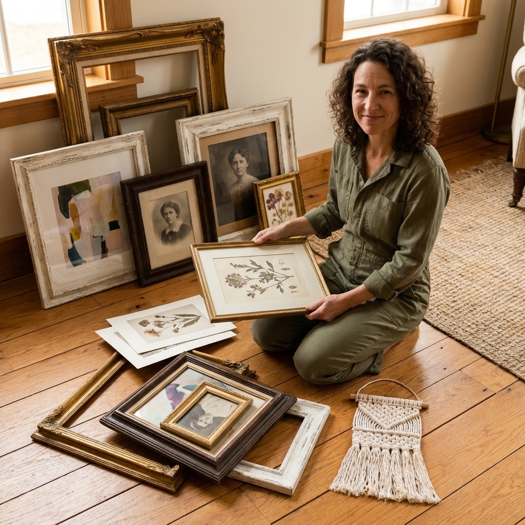
Before you measure anything, pull everything you might include and lay it on the floor. I’m talking framed art, unframed prints, postcards, little canvas paintings, baskets, woven mini hangings, even a sculptural wall hook or small mirror.
My quick yes checklist
- Does it make me feel something? A memory counts. A color crush counts.
- Does it support my threads? It does not have to match, but it should relate.
- Is there variety? At least one piece with texture (woven, embroidered, relief, carved wood).
- Is there breathing room? Not everything can be high-contrast. Mix in softer pieces.
Then edit. The easiest edit is removing anything that feels like a different story (a super glossy corporate print in the middle of warm, worn-in pieces) or anything that is the same size and vibe as another piece.
Want more ideas for finding soulful pieces without the big price tag? Start here: Budget Boho & Thrifting and my favorite hunt list in 10 Thrift Store Staples for Authentic Boho Style.
Pick a layout style
There are a few classic layouts that work beautifully for eclectic homes. Choose one based on your wall size and your tolerance for “perfect.”
1) Organic cluster (my go-to)
Soft edges, mixed sizes, feels collected. Great for mixed frames and woven hangings.
2) Grid-ish
Still eclectic, but calmer. Works well if your art is visually busy or your room already has a lot going on.
3) Salon-style
Maximal and dramatic. Looks best when you repeat a few frame finishes and include some larger anchors.
4) Ledge anchored
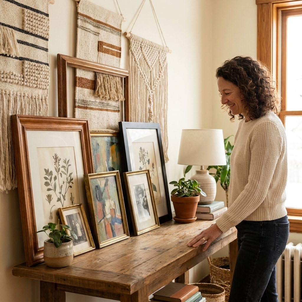
If you can add a picture ledge, you can swap art seasonally and avoid tons of nail holes. Even if you hang everything, you can mimic this by aligning a bottom row.
Measure with a rule of thumb
You do not need complicated formulas, but you do need two things: a clear boundary and a good center line.
Step 1: Define the zone
- Above a sofa, console, or bed: a helpful starting point is keeping the overall gallery width about 2/3 to 3/4 the width of the furniture.
- Hallway or stair wall: define the zone by the path of movement. Make sure nothing feels like it’s drifting into a corner.
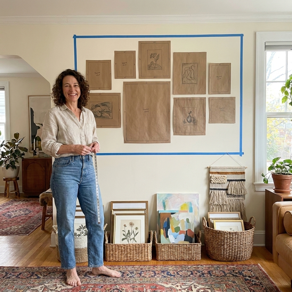
- Blank wall: use painter’s tape to outline the maximum width and height you want. This is my best trick for avoiding a tiny floating cluster.
Step 2: Find the visual center
A common gallery guideline is placing the center of the overall arrangement often around 57 to 60 inches from the floor, give or take based on your household and ceiling height. If it’s above furniture, the furniture changes the rules. As a starting point, the bottom of your lowest frame often looks good around 6 to 10 inches above the top of the piece, then you adjust for scale.
If you have very high ceilings, let the furniture anchor the “zone,” then build upward so the arrangement feels connected, not stranded at eye level with a mile of blank wall above it.
Step 3: Choose your anchors
Pick one to three larger pieces to act as anchors. These are your deep breaths. Everything else can orbit around them.
Plan before holes
I’m a big believer in planning on the floor first, then transferring to the wall. It saves time and it saves your drywall from looking like Swiss cheese.
My floor method
- Lay down your anchors first. Place the largest pieces where you want the eye to land.
- Add medium pieces next. Build a loose shape around the anchors.
- Fill with small pieces and texture. Add postcards, small paintings, woven minis, or a tiny mirror.
- Step back and squint. You’re checking balance: is one side too heavy or too busy?
- Take a photo. Your camera is brutally honest. If something feels off, it will show up in a photo.
Spacing that feels collected
- Start with 2 to 3 inches between frames as a baseline.
- Go tighter (about 1.5 to 2 inches) for a dense, salon-style wall.
- Go wider (about 3 to 4 inches) if your frames are chunky or your wall is very large.
Tip for mixed frames: keep spacing more consistent than frame finishes. Consistent spacing is the secret ingredient that makes a wildly mixed wall still look polished.
Choose hanging hardware
This is the unglamorous part that makes the whole thing feel easy later. The right hardware depends on two things: your wall type and your frame weight.
- Lightweight frames: a simple picture hook is often enough, as long as it’s rated for the weight.
- Medium and heavy frames: use a proper wall anchor for drywall, or aim for a stud when you can.
- Plaster, brick, or concrete: use hardware made for that surface (and if you’re renting, it’s worth asking what your walls are before you start).
- Two hang points: for wide frames, using two D-rings helps prevent tilting.
Before you start, flip each frame over and make sure the hardware is secure. Loose D-rings are a gallery wall’s silent enemy.
Mix frames like jewelry
Think of frames like accessories. You can mix metals and woods, but you want repetition so it feels intentional.
Frame-mixing rules that work
- Repeat each finish at least twice. If you have one lonely gold frame, it will look accidental. Add another gold somewhere else.
- Mix thicknesses on purpose. Combine thin metal frames with chunky vintage wood, but avoid having everything be medium-thickness.
- Use mats as a volume knob. If your wall feels loud, adding white mats quiets it instantly.
- Let one finish be the supporting actor. Example: 60% warm wood, 30% black, 10% brass.
Thrift-store frame rescue
If you find a frame you love but the color is wrong, a quick paint job can make it play nicely with the rest. I like matte black for grounding, warm cream for softness, and rubbed bronze when I want a little vintage drama.
Add texture
Eclectic gallery walls come alive when everything is not behind glass. Texture breaks up the rectangles and adds that global, collected feeling.
Easy textured pieces to mix in
- Small woven wall hanging (especially great between frames where you need softness)
- Flat baskets (hang from an integrated loop or use a plate hanger when possible, and choose wall-safe hooks or anchors for the weight)
- Textile fragments (block-printed fabric or a vintage scarf in a frame)
- Mini mirrors (bounce light and make small spaces feel bigger)
- Carved wood masks or plates (use sparingly, then repeat the wood tone elsewhere)
If you love the layered, natural vibe, you might also like Textiles & Natural Elements and Layering Vintage and Jute Rugs. Different surface, same idea: mix texture, repeat tones.
Hang with a calm order
Hanging is the part that scares people, but it’s mostly about doing it in a sensible order.
What I actually use
- Tape measure
- Pencil
- Painter’s tape
- Level
- Hammer and picture hooks (or appropriate wall anchors)
- Optional: rubber bumpers for frame corners
The order that prevents chaos
- Mark your gallery zone (light painter’s tape outline).
- Start with your main anchor near the center (often one of the heavier pieces).
- Place other heavier pieces early so you are not trying to squeeze them in later.
- Build outward adding one piece at a time, checking spacing as you go.
- Keep stepping back every 2 to 3 frames.
Two tricks that save your wall
- Use paper templates: trace each frame on paper, cut it out, and tape it to the wall. Mark the hanger point on the paper. Remove paper after you hang.
- Mind the hardware shift: sawtooth hangers and D-rings sit differently. Measure from the top of the frame down to the hanging point so your heights stay true.
Finish with small moves
Once everything is up, the last bit is what makes it look intentional, even if you thrifted the whole thing.
- Add a small light source nearby: a table lamp or plug-in picture light makes the wall feel styled at night. If you go plug-in, plan simple cord management (paintable cord cover or tidy routing) and choose a mounting method that matches your wall and rental situation.
- Echo something from the wall in the room: a pillow color, a rug tone, a plant pot finish.
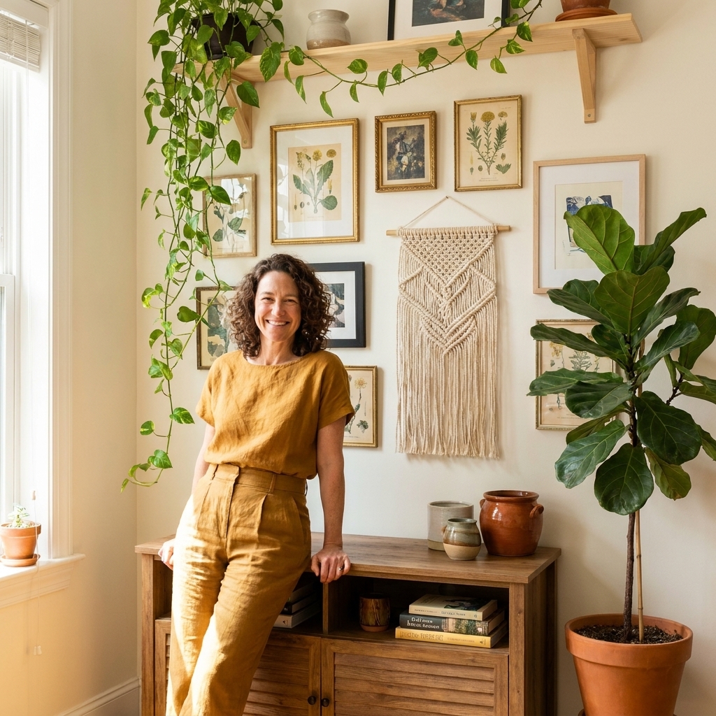
- Include one unexpected piece: a tiny woven fan, a framed matchbook collection, a pressed fern, a hand-painted tile.
- Give it a living neighbor: a tall plant or trailing pothos nearby makes a gallery wall feel softer and more boho.
If you’re in a plant era (I always am), wander into The Indoor Jungle for ideas on pairing art and greenery without making the room feel crowded.
One quick preservation note: if your wall gets direct sun, consider moving originals, photos, and textiles out of the brightest path. Humid spots (like right next to a steamy bathroom) can also be tough on paper and fabric.
Common problems and fixes
It looks messy
Fix: tighten your spacing consistency, add 1 to 2 mats, or remove one high-contrast piece that is shouting.
It looks like it’s floating
Fix: lower the whole arrangement, widen the overall footprint, or add one larger anchor piece.
The frames fight each other
Fix: repeat the “odd” finish at least one more time, or paint two frames the same color to create a calm base.
My wall feels too busy
Fix: choose a grid-ish layout, use more white space, and keep your art palette tighter.
I’m renting and I’m nervous
Fix: keep pieces lighter where possible, use removable hanging solutions that match the weight rating, and consider a ledge-anchored arrangement so you can swap without rehanging everything.
A quick formula
If you want an eclectic gallery wall that works almost every time, use this simple formula:
- 2 large anchors (16x20-ish or similar visual weight)
- 4 to 6 medium pieces (8x10, 11x14, small canvases)
- 4 to 8 small pieces (postcards, mini prints, tiny frames)
- 1 to 2 texture pieces (woven, basket, small mirror)
- 2 repeated frame finishes minimum, plus one accent finish
Build it slowly if you need to. The best gallery walls are allowed to evolve. That’s kind of the point.