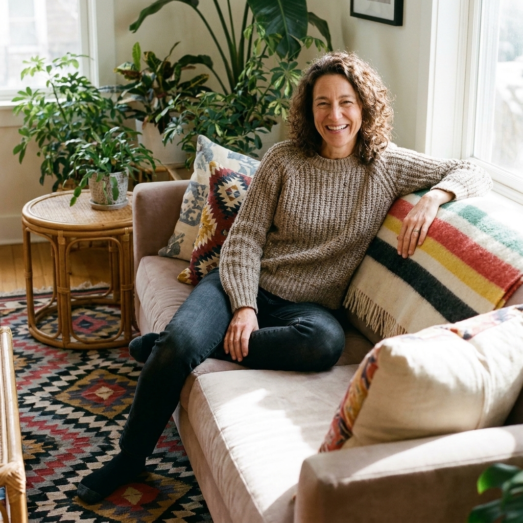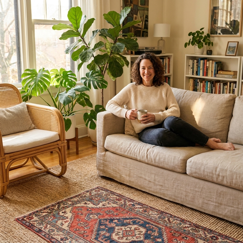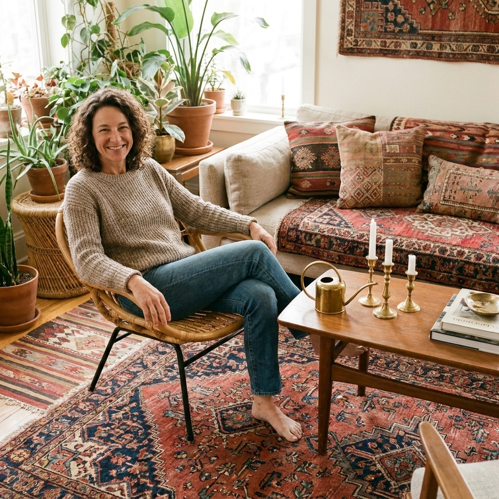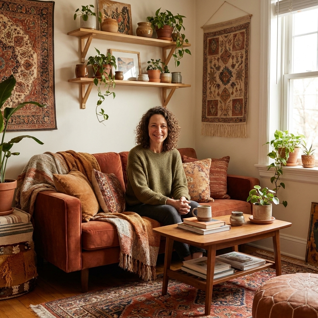

Every time I rearrange my living room (which is often), I end up asking the same question: do I want my space to feel sunbaked and grounded, or rich and glowy like a velvet curtain at golden hour?
That is basically the heart of earth tones vs. jewel tones. Both show up a lot in boho and eclectic homes because they play nicely with vintage pieces, natural textures, and a little bit of chaos. The difference is the mood they set and how they behave once you start layering patterns and thrifted treasures.
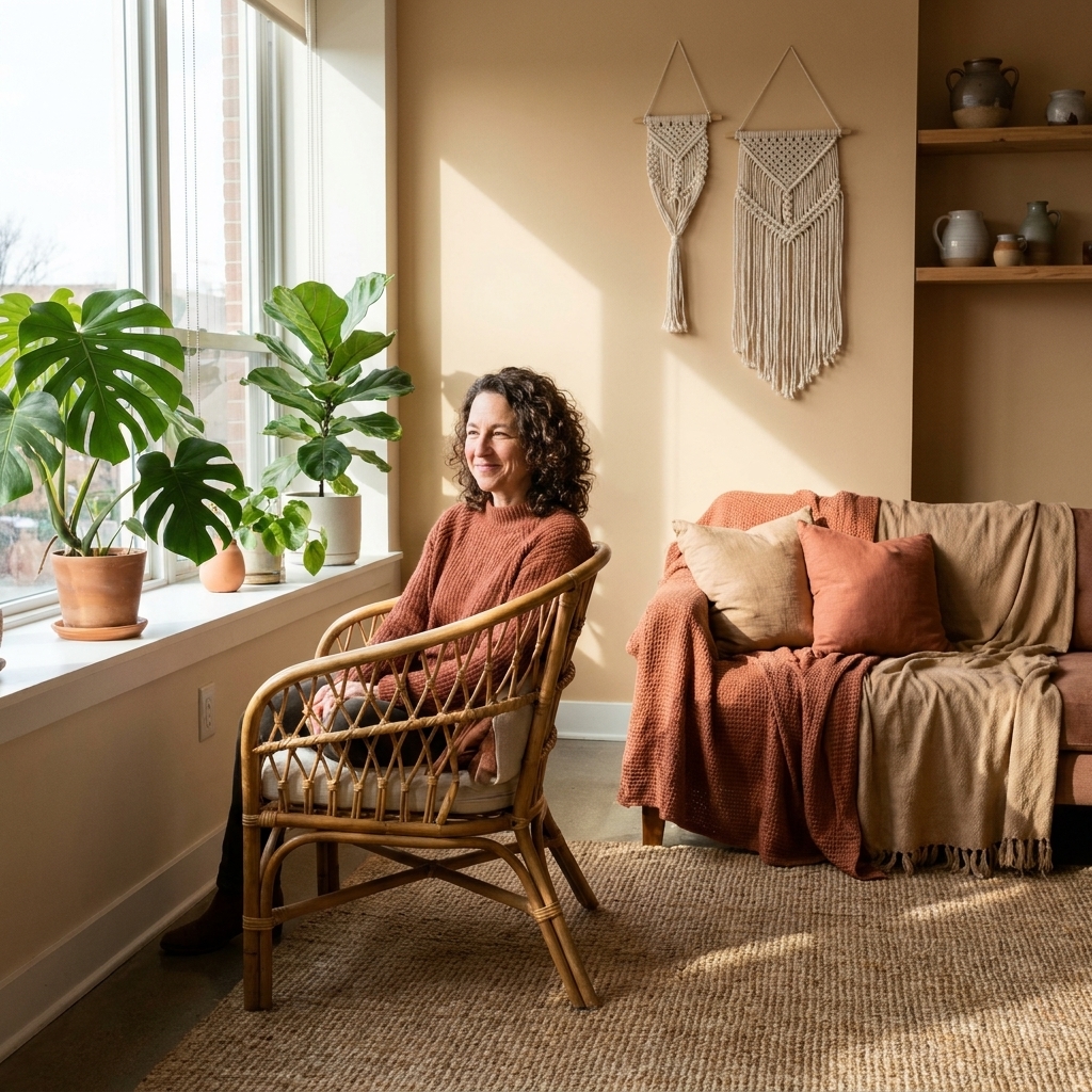
Earth tones vs. jewel tones: the vibe check
Earth tones
Earth tones are colors you could scoop up from a landscape: clay, rust, ochre, sand, camel, warm white, olive, sage, bark brown, charcoal. They tend to read calm, collected, and lived-in even when your furniture mix is all over the place.
- Best for: cozy, grounded rooms, rentals you cannot repaint, spaces with lots of wood and natural fibers
- Pairs well with: jute, sisal, rattan, linen, worn leather, pottery, aged brass, black accents
- Easy win: patterns often look less loud when the colors are dusty and warm
Jewel tones
Jewel tones are saturated and dramatic: emerald, sapphire, amethyst, ruby, garnet, teal, fuchsia. (And yes, I still love a mustardy gold here, even if it is technically more earthy. It just plays really well with jewel tones as an accent.) They can make a room feel intentional quickly, especially when you mix in vintage and global-inspired pieces.
- Best for: maximalist corners, moodier rooms, creative spaces, homes with good natural light or warm lamps
- Pairs well with: velvet, carved wood, brass, lacquer, dark woods, patterned rugs, gallery walls
- Easy win: one jewel tone can make thrifted basics look designer
If earth tones are “desert road trip,” jewel tones are “old library with a playlist on.”
How to use 60-30-10
Before we get into specific palettes, here is the little rule that keeps eclectic color from turning into a free-for-all.
The 60-30-10 rule is my favorite way to make eclectic color feel pulled together without sucking the personality out of the room.
- 60%: your main backdrop color story (walls, largest rug, sofa, big curtains)
- 30%: your secondary supporting color story (accent chairs, bedding, a second rug layer, larger art)
- 10%: your spicy little accent (pillows, throws, pottery, lampshade, small art, books)
In real life, that 60% is usually a blend. For example: “warm white plus sand plus wood” still reads like one calm base.
Want to go deeper on pattern without visual chaos? I break it down step-by-step here: How to Mix Bold Patterns Without Clashing.
Earth tone palettes
Earth tones do not have to be boring. The trick is mixing warmth (clay, rust, camel) with soft contrast (cream, charcoal, deep olive) so the room still has shape.
Go-to earth tone blends
- Terracotta + cream + olive (warm, plant-friendly, looks great with rattan)
- Ochre + sand + walnut brown (golden and cozy, perfect for vintage wood)
- Rust + blush + charcoal (a little romantic, a little grounded)
- Sage + warm white + black (calm but crisp, great for small spaces)
Earth tones with 60-30-10
- 60%: warm white walls, jute rug, light linen curtains
- 30%: camel sofa or bedding, medium wood tones, woven baskets
- 10%: terracotta and olive accents, pottery, a rust throw
If you love rugs (same), earth tones are a dream for layering because they tend to be more forgiving with undertones. My favorite approach is here: Layering Vintage and Jute Rugs.
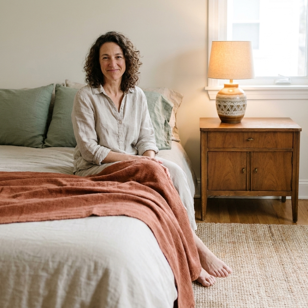
Jewel tone palettes
Jewel tones are gorgeous, but they can go costume-y if everything is equally saturated and shiny. The easiest fix is to mix jewel tones with weathered neutrals and matte textures so it still feels collected.
Go-to jewel tone blends
- Emerald + warm walnut + brass (classic, moody, vintage-friendly)
- Sapphire + cream + tan leather (clean contrast with a cozy edge)
- Amethyst + dusty pink + dark wood (romantic but not sweet)
- Teal + gold + black (playful and artsy, great for gallery walls)
Jewel tones with 60-30-10
- 60%: deep teal wall or a large jewel-toned rug as the anchor
- 30%: warm neutrals like cream curtains, wood furniture, a tan leather chair
- 10%: ruby or golden accents in pillows, art, candles, and books
My favorite jewel-tone shortcut is a thrifted rug with a saturated base color. It gives you a ready-made palette, and the wear and fade keeps it from feeling too glossy.
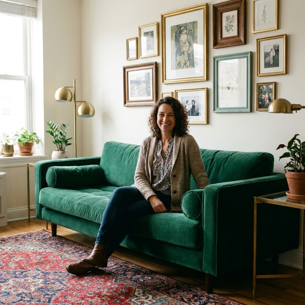
If you want both
You do not have to choose a team for life. Some of my favorite rooms are a warm, earthy base with a couple of jewel-tone punches.
Bridge palette ideas
- Earth base, jewel accents: warm white walls + jute + wood, then add emerald pillows and a deep blue vase.
- Jewel anchor, earthy support: a sapphire rug or teal sofa, then keep everything around it sandy, camel, and linen.
The trick is deciding who is the lead. Let one palette do the 60%, and let the other show up in the 10% and little repeats.
How to choose
1) Brighter or moodier?
- Brighter: earth tones with creamy whites and sand colors
- Moodier: jewel tones, especially with deeper woods and warm lighting
2) What is your non-negotiable piece?
If you already own a statement rug, sofa, or vintage textile, let it choose the palette.
- A kilim with rust and camel? Earth tones will feel effortless.
- A dramatic print with teal and magenta? Jewel tones will make it sing.
3) How much visual movement can your space handle?
Small rooms can absolutely do jewel tones, but you will usually want a calmer 60% so the space does not feel busy. Earth tones naturally create that calm base, even when you mix patterns.
Lighting and undertones
This is the part that makes people feel like color is gaslighting them. Your palette does not live in a vacuum, it lives under whatever light your room gets.
- Warm bulbs and evening lamp light make earth tones feel extra cozy and make jewel tones feel richer (sometimes a bit moodier).
- Cooler daylight, north-facing light, or cooler bulbs can make some earth tones read a little flat and can make jewel tones feel crisper and higher contrast.
If something feels off, I usually adjust light temperature first, then decide if the color needs tweaking.
Texture first
When a room feels flat, we tend to blame color. Most of the time, it is texture. Boho and eclectic spaces look layered because they combine a mix of surfaces.
Texture boosters for earth tones
- Jute and seagrass
- Rattan and cane
- Raw wood and pottery
- Linen and chunky knits
Texture boosters for jewel tones
- Velvet and embroidered textiles
- Carved wood, lacquer, and glossy ceramics (sparingly)
- Antique brass and warm metals
- Patterned rugs with some age and fade
If you are a plant person (hi, welcome), both palettes benefit from greenery. Earth tones lean natural and quiet, jewel tones make foliage look extra vivid. If you want plant styling ideas, I keep my favorites here: The Indoor Jungle.
Thrifting tips
I learned this the hard way: it is easy to thrift a cart full of cute and then get home with zero cohesion. Now I thrift by palette.
For earth tones
- Terracotta planters, stoneware, woven baskets
- Worn wood frames, vintage brass, leather
- Textiles in faded rust, ochre, and olive
For jewel tones
- Velvet pillows, needlepoint, embroidered table runners
- Glassware in emerald or cobalt
- Art with a strong dominant hue you can echo around the room
If you want a simple shopping list that works for both palettes, I put my favorites here: 10 Thrift Store Staples for Authentic Boho Style.
Two starter palettes
Earth tone starter palette
- 60%: warm white, sand, light wood
- 30%: camel, olive
- 10%: terracotta, rust, or matte black
Jewel tone starter palette
- 60%: cream, warm beige, medium wood
- 30%: emerald or deep teal
- 10%: golden accents or brass, plus one small hit of ruby if you want it
Both palettes are forgiving, both are eclectic-friendly, and both look amazing with vintage textiles. The right choice is the one that feels like you when you walk in the room at night, lamp on, shoes off.
Common mistakes
Mistake: everything matches too perfectly
Fix: add one oddball item with history. A carved bowl, a faded textile, a thrifted frame. Eclectic needs a little friction.
Mistake: the palette feels muddy
Fix: increase contrast. Add cream to lift earth tones, or add charcoal and black to give jewel tones structure.
Mistake: you used 10 accents instead of a 10% accent
Fix: pick one accent color and repeat it 3 times in a room. Three little echoes reads intentional.
Mistake: your metals are fighting
Fix: choose one main metal (often brass in boho spaces) and let other metals show up as vintage exceptions, not equal co-stars.